Kaspersky's Pricing Screen
Kaspersky's Pricing Screen
Kaspersky's Pricing Screen
How to enhance Kaspersky's app Pricing Screen for a better user experience and increase Free Trial clickthrough rates through strategic design changes?
How to enhance Kaspersky's app Pricing Screen for a better user experience and increase Free Trial clickthrough rates through strategic design changes?
How to enhance Kaspersky's app Pricing Screen for a better user experience and increase Free Trial clickthrough rates through strategic design changes?

Client
Kaspersky
My Role
Product Designer
Industries
Cyber Security
Tools
Figma
Introduction
Introduction
Kaspersky offers a comprehensive ecosystem with solutions covering spam calls, chat and password protection, Wi-Fi security, data privacy, leak detection, and child content filtering.
Mobile antivirus is the second most important and profitable product for B2C in the company. In first place is antivirus for Windows. The product is used by 7 million people. At the same time, the product has one of the highest ratings among antivirus solutions in stores.
Problem
Problem
Pricing pages must be crystal clear to keep potential paying users moving forward. Recent usability testing revealed a significant challenge: half of the app downloaders struggled to differentiate between various tariff plans.
Pricing pages must be crystal clear to keep potential paying users moving forward. Recent usability testing revealed a significant challenge: half of the app downloaders struggled to differentiate between various tariff plans.
Goal
Goal
Redesign the Pricing Plans screen and increase the Free Trial clickthrough rate.
Redesign the Pricing Plans screen and increase the Free Trial clickthrough rate.
Who are the Users?
Who are the Users?
According to Kaspersky Lab research, there are 4 main groups of target audience: "Infoworkers", "IT Geeks", Parents of primary-school children, "Family IT Administrators".
According to Kaspersky Lab research, there are 4 main groups of target audience: "Infoworkers", "IT Geeks", Parents of primary-school children, "Family IT Administrators".

Design Process
Design Process
1
Discover
During the Discovery stage, I started by examining key metrics such as a 12% Free Trial clickthrough rate and 96,000 monthly app downloads. I hypothesized a 25% improvement in the Free Trial clickthrough rate through a Pricing Screen redesign. Following that, I conducted a competitors' analysis (Norton, McAfee, Avast) to identify their strengths and weaknesses. After that, I performed user interviews and quick corridor tests as part of User Research to gain a better understanding of users' needs and pains. This helped shape the next steps in the design process.
2
Define
In the Define stage, I extracted vital insights from user research, crafted hypothesis statements for later testing, developed Jobs To Be Done (JTBD) to maintain a customer-centric focus, and formulated potential design solutions.
2
Define
In the Define stage, I extracted vital insights from user research, crafted hypothesis statements for later testing, developed Jobs To Be Done (JTBD) to maintain a customer-centric focus, and formulated potential design solutions.
3
Develop & Deliver
I initiated this stage by sketching ideas to visualize the upcoming changes. Faced with two potential options, I conducted swift user testing to decide between them. After, I progressed to creating high-fidelity wireframes, finalizing the design, conducting usability testing, and ultimately providing the development team with all the necessary components and documentation.
User Research
User Research
1
Hypotheses Tested:
- Users find it challenging to distinguish features included in each pricing plan. - Users struggle to grasp the differences between plans because there are 4 Pricing cards, making it overwhelming. - Explaining the differences between plans in the title makes it hard for users to understand; adding icons would make it clearer. - Users struggle to identify the recommended plan. - The visual design of the pricing screen could be enhanced for a more modern and engaging experience.
2
Key Findings from the Corridor Study:
- Respondents demonstrated confusion about plans features (what’s included into each plan). - Respondents observed that the Pricing screen is not informative enough, and it’s challenging to understand the differences between the tariffs. - Respondents expressed the feeling that there were 4–6 different types of tariffs, contributing to a sense of complexity or confusion. - The visual design was perceived as somewhat outdated and less engaging.
3
Key Findings from the In-Depth Interviews:
- Respondents mentioned that it’s hard for them to figure out what features are included in each plan. - Adding icons like “V” and “X” was widely recommended as a solution to enhance plan differentiation. - Respondents mentioned that it would be nice to see a more visually appealing design. Also, respondents noted that design on the current Pricing screen is different from the rest of the app.
4
Conclusions from the User Research
All tested hypothesis were validated. Both corridor study and in-depth interviews highlighted immediate usability issues, emphasizing the need for visual cues and improved plan differentiation.
4
Conclusions from the User Research
All tested hypothesis were validated. Both corridor study and in-depth interviews highlighted immediate usability issues, emphasizing the need for visual cues and improved plan differentiation.

Design Solutions
Design Solutions
1
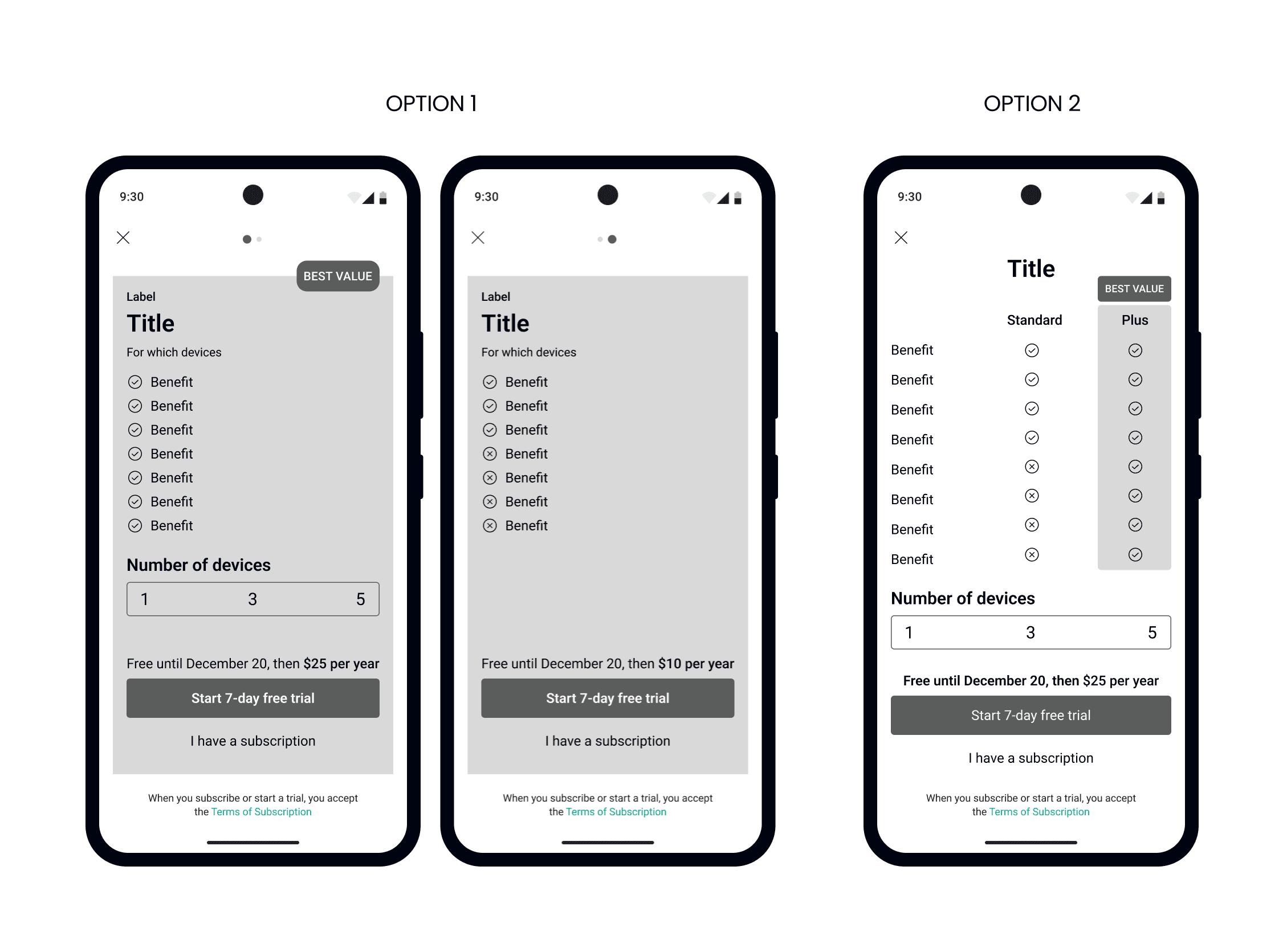
Reduce the number of tariff cards from 4 to 2
Reducing the number of tariff cards from 4 to 2 will help avoid cognitive overload for users navigating the pricing screen within 4 weeks after launch, impacting improved user understanding and increase in engagement with tariff details.
1
Reduce the number of tariff cards from 4 to 2
Reducing the number of tariff cards from 4 to 2 will help avoid cognitive overload for users navigating the pricing screen within 4 weeks after launch, impacting improved user understanding and increase in engagement with tariff details.
2
Add a comparison between tariffs
Adding a comparison between tariffs will increase user understanding and reduce confusion regarding the key differences between plan features, leading to a decline in reported challenges in understanding tariffs within 4 weeks after launch.
2
Add a comparison between tariffs
Adding a comparison between tariffs will increase user understanding and reduce confusion regarding the key differences between plan features, leading to a decline in reported challenges in understanding tariffs within 4 weeks after launch.
3
Highlight the premium plan
Implementing an interactive switcher will improve visibility into price differences, promote special offers awareness, and increase user engagement. This can result in more informed choices and potentially higher adoption of special offers within 4 weeks after launch.
3
Highlight the premium plan
Implementing an interactive switcher will improve visibility into price differences, promote special offers awareness, and increase user engagement. This can result in more informed choices and potentially higher adoption of special offers within 4 weeks after launch.
4
Implement an interactive device switcher
Implementing an interactive switcher will improve visibility into price differences, promote special offers awareness, and increase user engagement. This can result in more informed choices and potentially higher adoption of special offers within 4 weeks after launch.
5
Highlight the price more prominently
Highlighting the price more prominently, using a crossed-out original price to indicate a discount, aims to encourage users to click the “Start Free Trial” button. This visual strategy anticipates a 25% increase in Free Trial clickthrough rate within 4 weeks after launch.

Conclusion
In the realm of technology, artificial intelligence (AI) and machine learning have emerged as game-changers, particularly in the field of UI/UX design. The integration of these advanced technologies is reshaping how we approach design, offering new possibilities and challenges. This post aims to explore how AI and machine learning are influencing the field of UI/UX, bringing a new dimension to user experiences and interfaces.
Key learnings
Key learnings
1
Bringing a new dimension to user experiences and interfaces.
In the realm of technology, artificial intelligence (AI) and machine learning have emerged as game-changers, particularly in the field of UI/UX design. The integration of these advanced technologies is reshaping how we approach design, offering new possibilities and challenges. This post aims to explore how AI and machine learning are influencing the field of UI/UX, bringing a new dimension to user experiences and interfaces.
2
Bringing a new dimension to user experiences and interfaces.
The integration of these advanced technologies is reshaping how we approach design, offering new possibilities and challenges
2
Bringing a new dimension to user experiences and interfaces.
The integration of these advanced technologies is reshaping how we approach design, offering new possibilities and challenges
3
Bringing a new dimension to user experiences and interfaces.
The integration of these advanced technologies is reshaping how we approach design, offering new possibilities and challenges. This post aims to explore how AI and machine learning are influencing the field of UI/UX, bringing a new dimension to user experiences and interfaces.
Next Steps
Next Steps
1
Bringing a new dimension to user experiences and interfaces.
In the realm of technology, artificial intelligence (AI) and machine learning have emerged as game-changers, particularly in the field of UI/UX design. The integration of these advanced technologies is reshaping how we approach design, offering new possibilities and challenges. This post aims to explore how AI and machine learning are influencing the field of UI/UX, bringing a new dimension to user experiences and interfaces.
2
Bringing a new dimension to user experiences and interfaces.
The integration of these advanced technologies is reshaping how we approach design, offering new possibilities and challenges
2
Bringing a new dimension to user experiences and interfaces.
The integration of these advanced technologies is reshaping how we approach design, offering new possibilities and challenges
3
Bringing a new dimension to user experiences and interfaces.
The integration of these advanced technologies is reshaping how we approach design, offering new possibilities and challenges. This post aims to explore how AI and machine learning are influencing the field of UI/UX, bringing a new dimension to user experiences and interfaces.